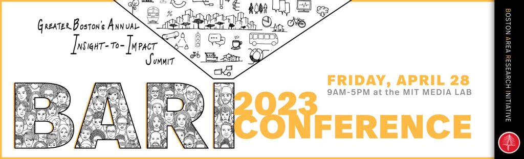
BARI Conference 2024: Greater Boston’s Annual Insight-to-Impact Summit is a forum where community leaders, practitioners, researchers, and policymakers gather to discuss societal change. Data is the core idea. It is used throughout the conference to build narratives and support plans that positively affect Boston’s communities. Although the work often includes concrete foundations, generating theories from hardened facts, these individuals were dreamers. I felt a responsibility to call that fact out with the work to come.
Dreaming is For Kids
In 2024, I co-founded a design studio with another designer, Jose, called Mr.Twist. A couple of months after we opened up, Kimberly Lucas, the Associate Director of Civic Research at NEU, reached out to see if we were available for a visual identity project. That project was BARI – Boston Area Research Initiative.
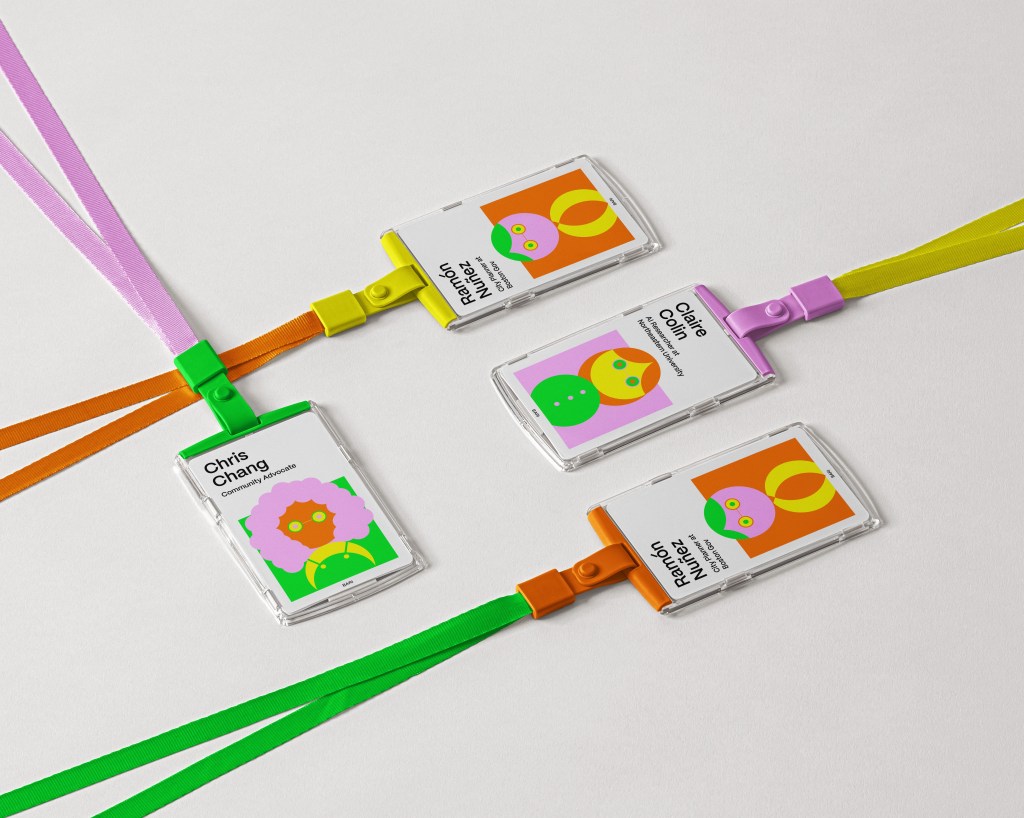
BARI was already in the works since 2020, and had either themselves or independent artists design their visual identity. The brief required the work to show the power of togetherness and diversity. As evident in the examples of past banners below, ‘people’ needed to be at the forefront.
I agreed. People need to be the most important aspect. I did, however, disagree with how it was portrayed.
Putting people next to each other while making their social backgrounds clear and obvious does not connect them together. And, for sure, it won’t help clarify BARI’s goal.
The one thing I remember, and still resonates with me to this day, was when asked of its goal, Kim said that she wanted to close her eyes and picture a community dancing and smiling together. That’s the energy she’d like to bring forth. Even if the topic usually only attracts “adults,” she wanted to feel a vibrant energy that a kid emanates.
Connecting the Dots
So, what does this community suppose to feel like?
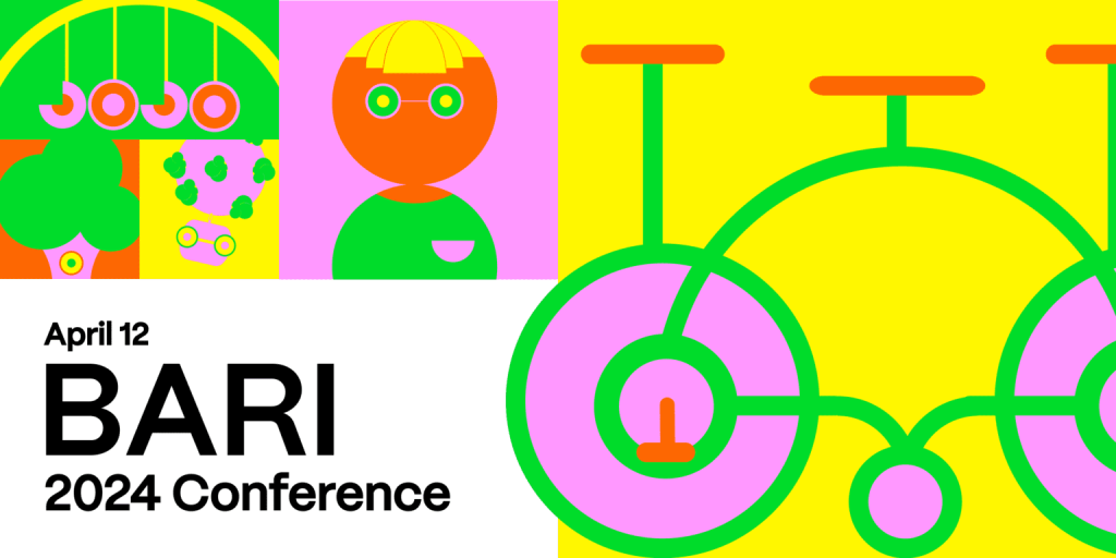
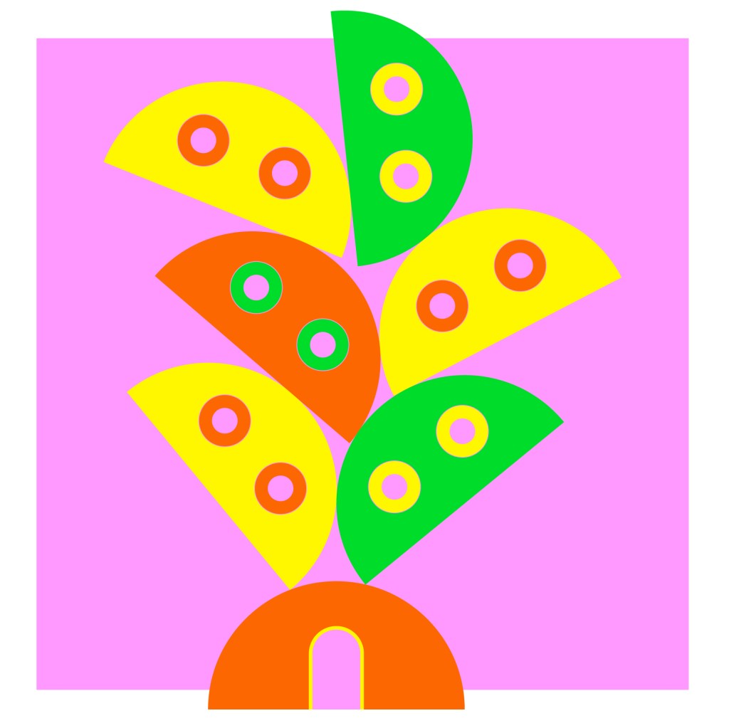
Collective Heartbeat (illustrated below) – It’s the term I came up with to really build the project around. You know, TFW you’re out dancing with a crowd, and it almost feels like your heartbeats are in sync. Pounding, thumping to the same beat. The visuals should communicate that excitement and vibrancy.
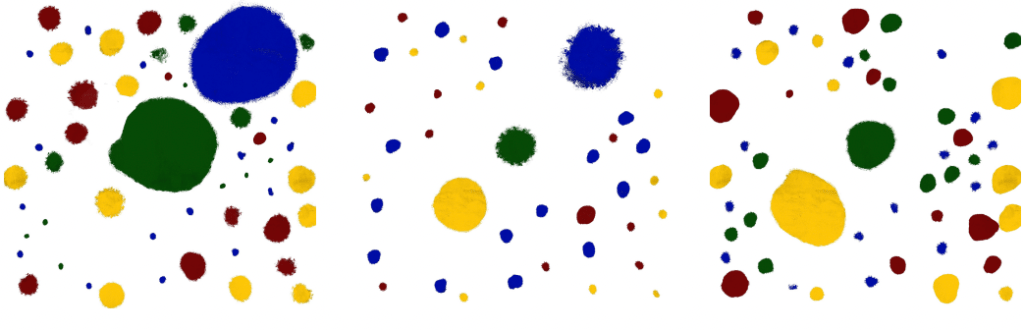
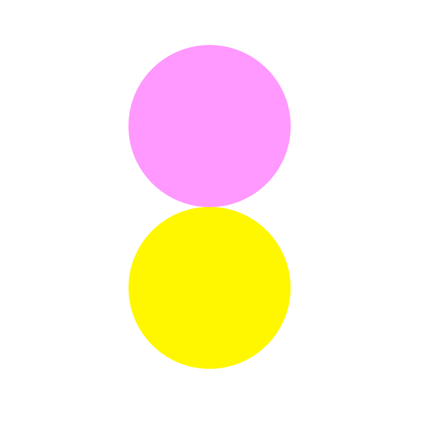
Our immediate research was to look at dots. DATA – DOTS. Right? Or should I say, data ‘points’?
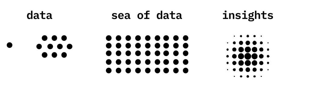
It felt right. A conference using data with a visual identity that illustrates data. We also came up with this logo mark in order to further expand the concept.
We had hoped that this would be a concept that would emulate the goal BARI is trying to accomplish, but it wasn’t. Feedback came in saying it was too hard to read and a little too “out there.” Yikes! Our client wasn’t thrilled with the idea andddd we’re back to the starting line.
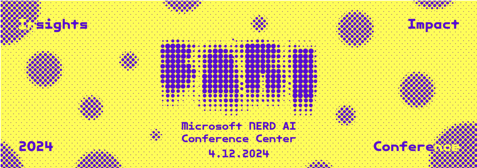
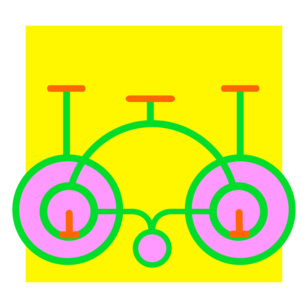
Our next iterations were centered around making the idea clearer and more human. Still, we weren’t ready to give up with the dots and came up with a system to illustrate the typography.
Making it more quirky, less robotic…
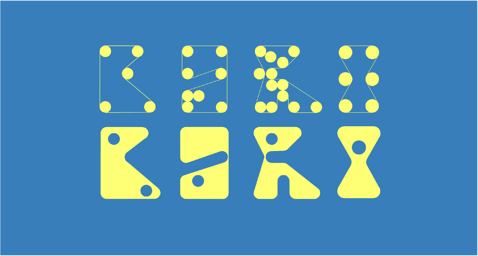
Another route we went with was trying to reroute our thinking. Maybe connections don’t need to be shown with dots; maybe connections can be shown with interlocking threads.
We loved these ideas because they made our original idea a lot more approachable. The colors in Iteration #2 were the right vibrancy to emulate that ‘feeling.’ And the quirkiness of iteration #1 was that human factor that was missing. They didn’t work for our clients. But they did, however, ask if there was any way we could combine these two ideas.
Hmm. Interesting. So, you’re saying this could work?
Ready…Set…DREAM!
Deadline was approaching, but it wasn’t like we were freaking out…
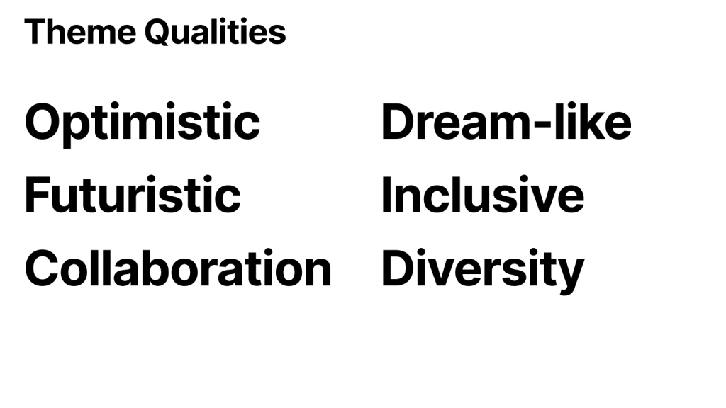
We knew the idea was close, so we kept digging. The themes below acted as our guidelines. We just needed to find a connector that brings all of these ideas together, and we thought …
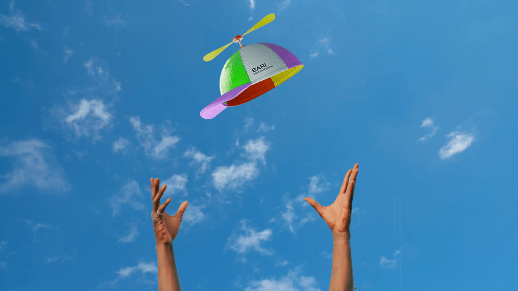
SCIENCE EXPO in the 1960’s!!!
It just clicks. It was at a time of inventors and innovators who invented works that still shape our lives today. It was the time when we reached for the stars. The time when things felt fresh and new, establishing a foundation for genuine hope.
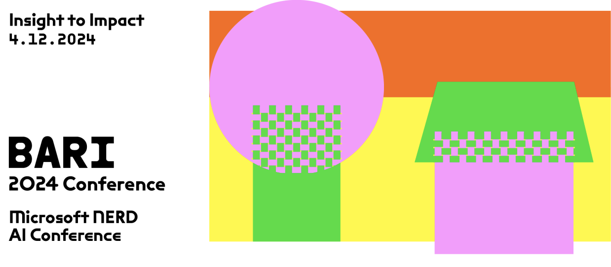
Finally, we get to play. And, you know where it all starts? Yeah! A DOT!
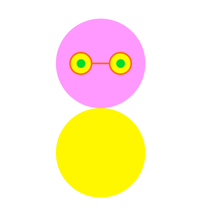
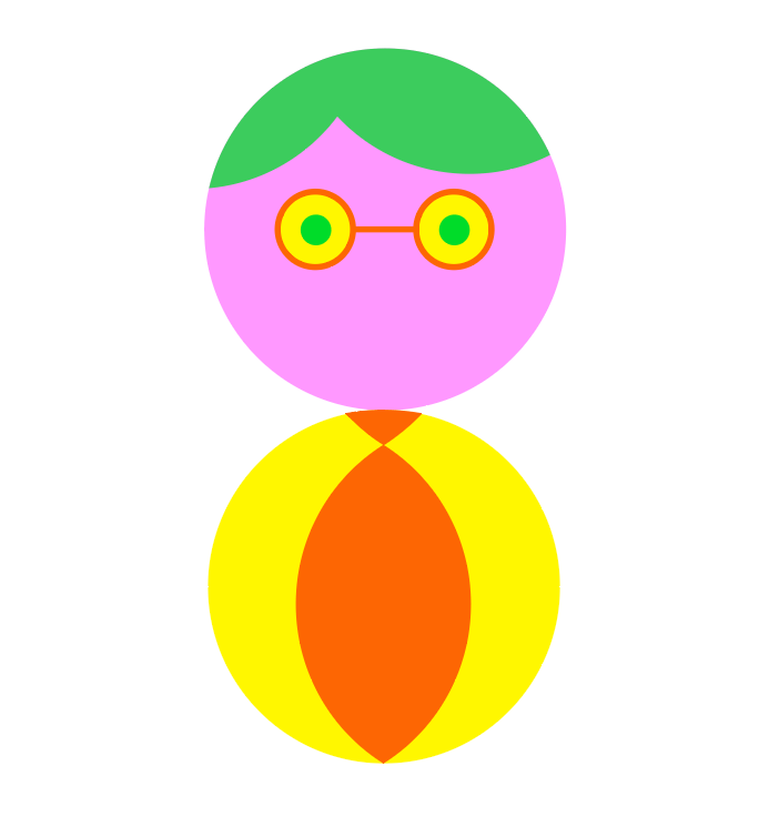
This little MANDOT was the baseline to everything we created afterward. Because of him, we made this…
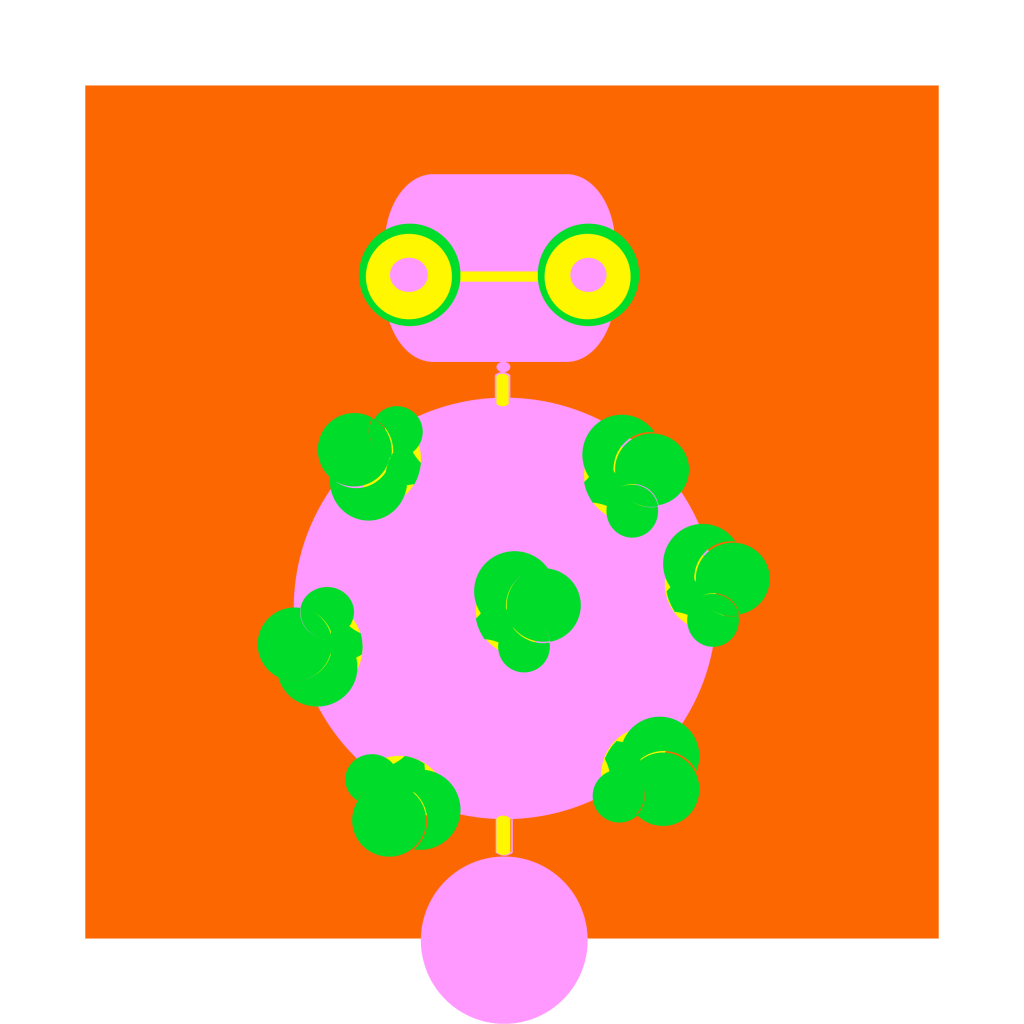
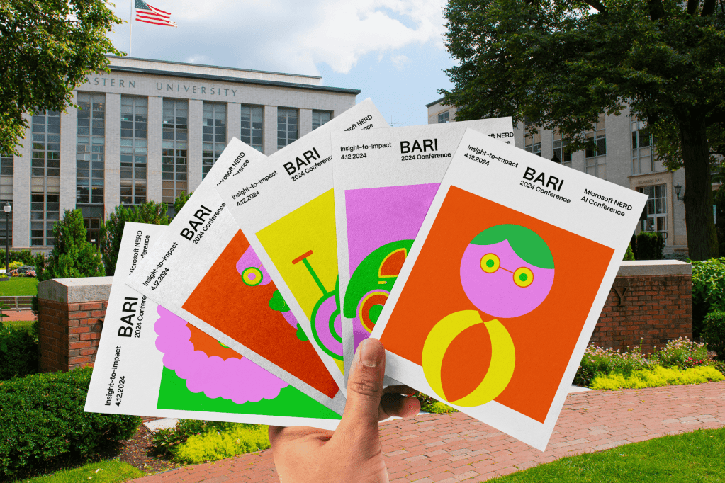
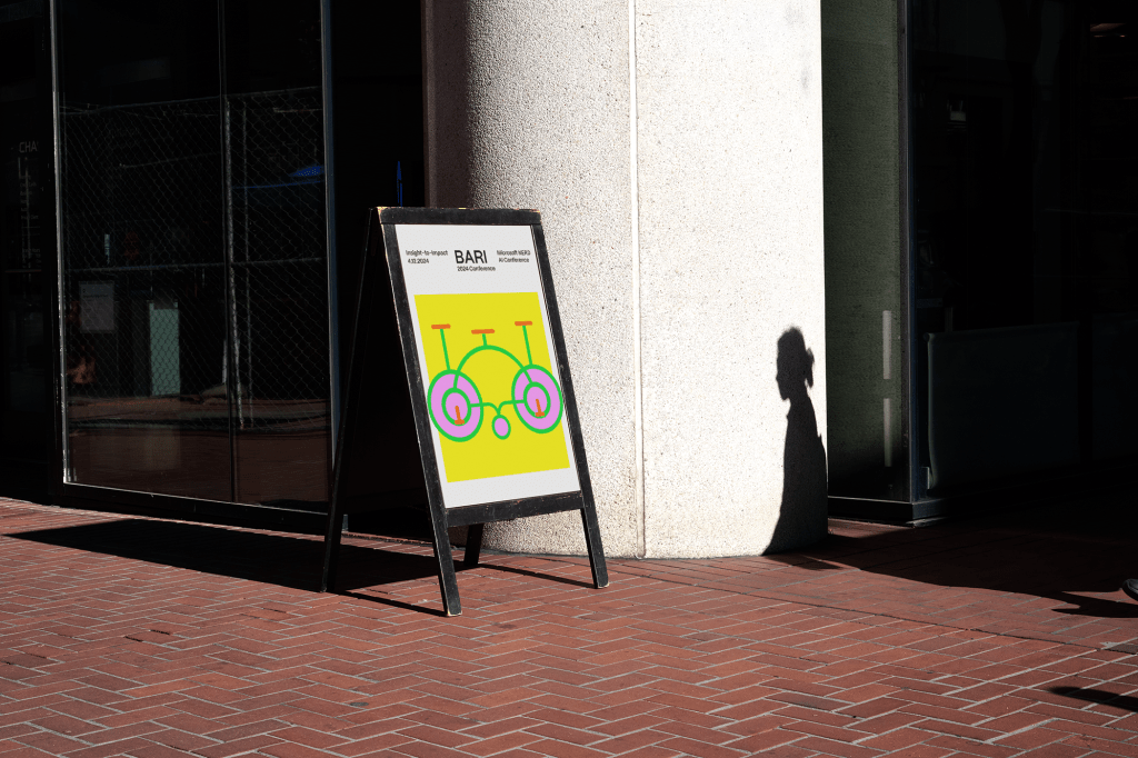
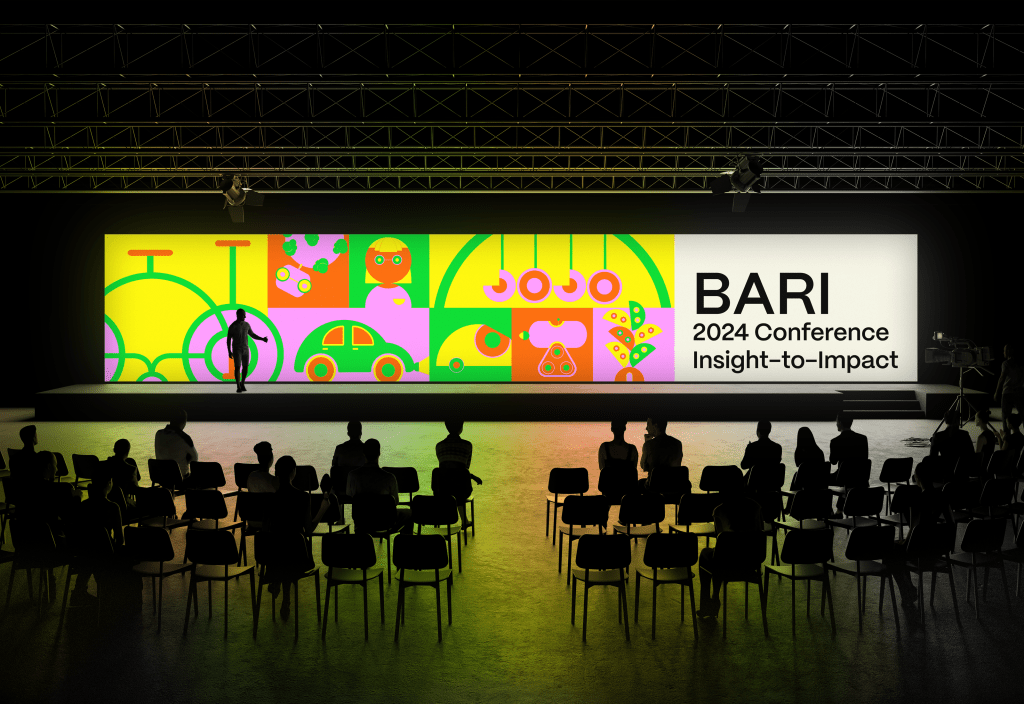
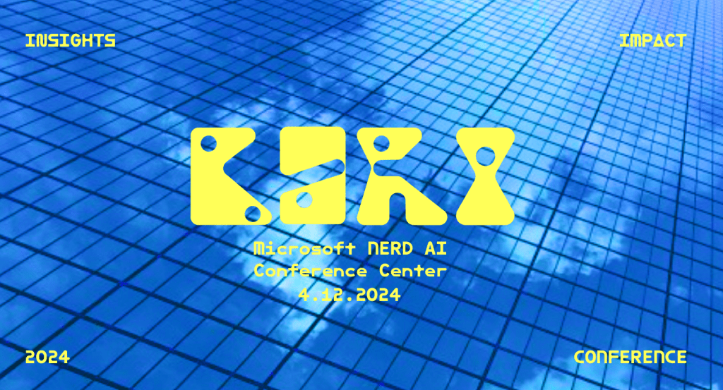
And because of him, we finally created the visual identity for BARI 2024.