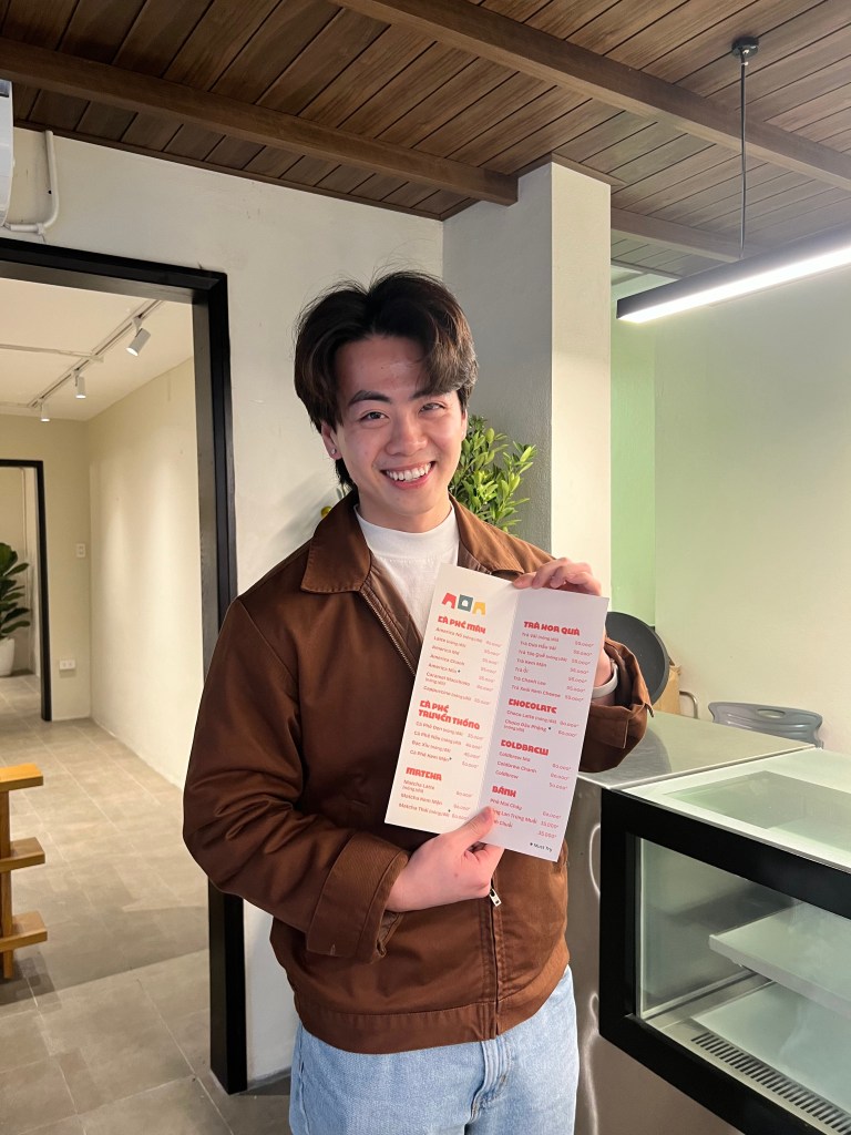
In Vietnamese, A cốc is a cup. But more than that, it also means a knock. It does play out perfectly when our client Anh approached us with the vision of his own cafe. One that provides his guests with the richness of Vietnamese coffee while being in the comfort of what has been Anh’s home for the past 20 years.
The Clunky Home
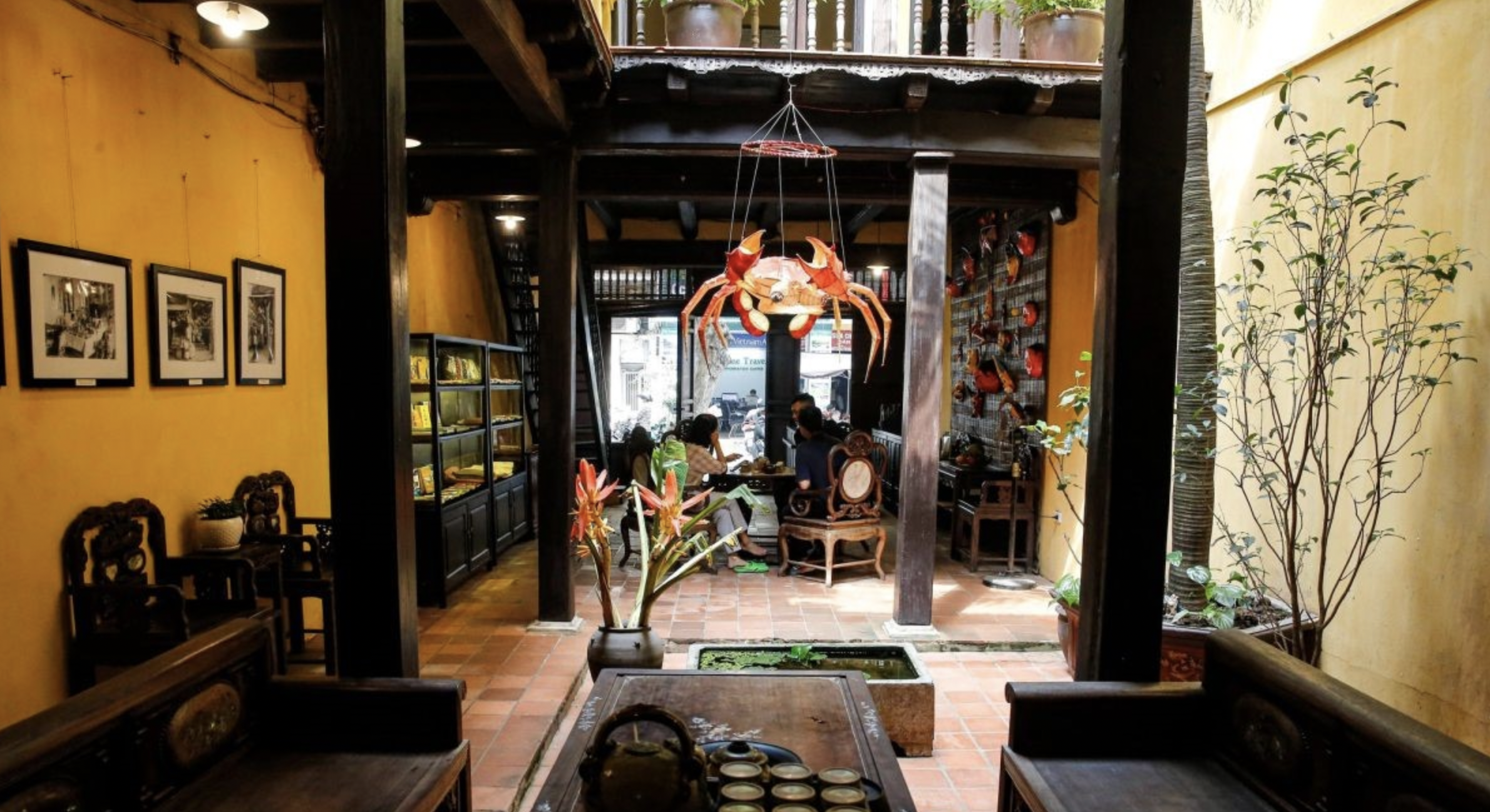
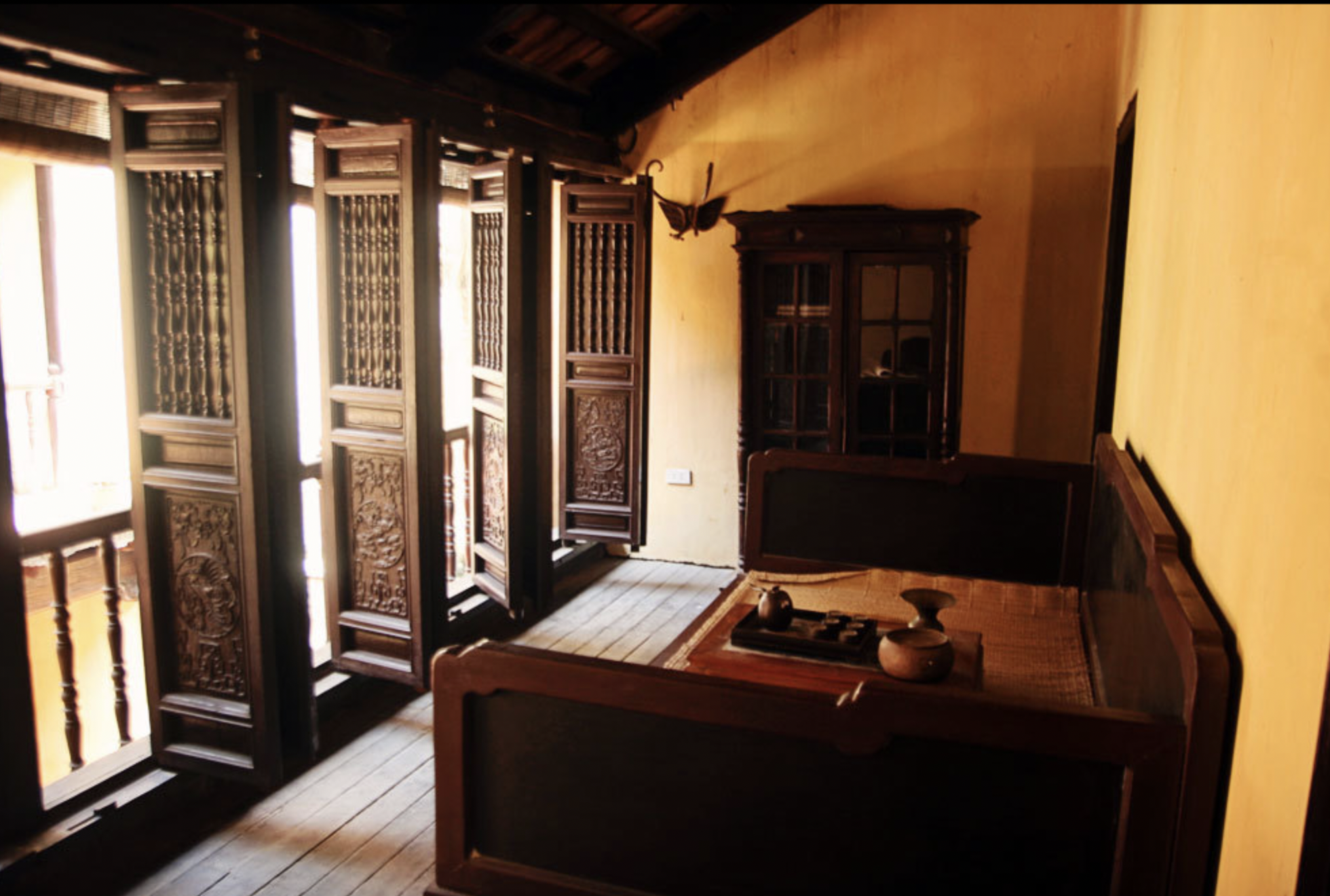
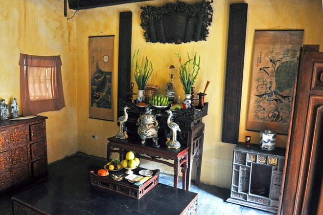
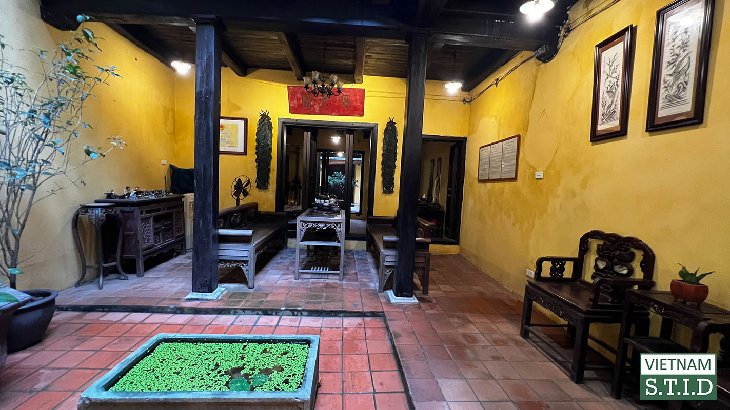
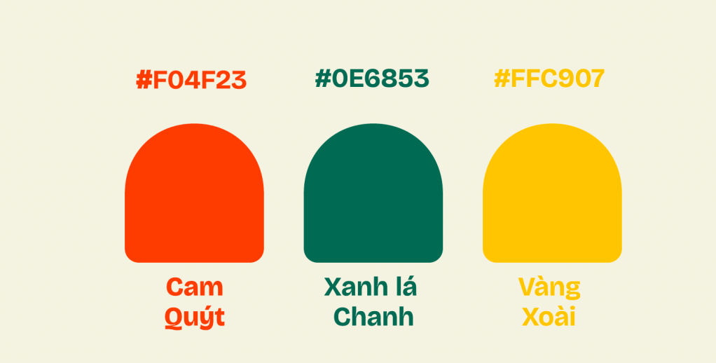
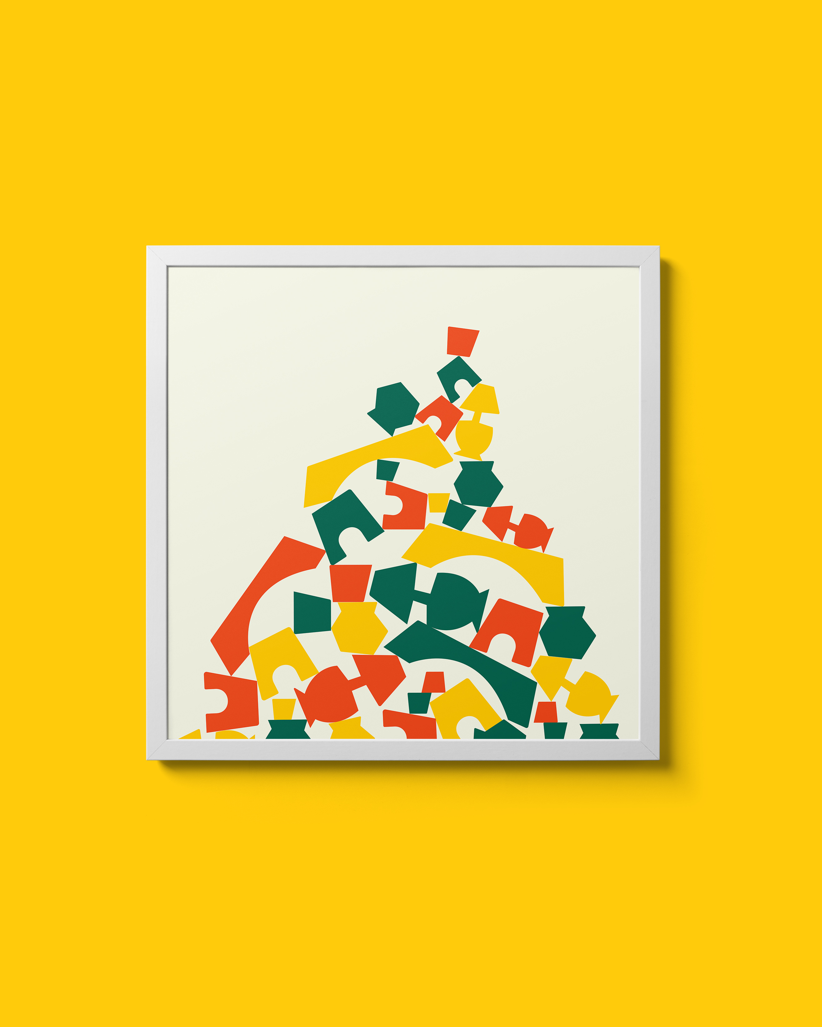
Homes in Vietnam can generally be described as vibrant, chaotic to the point that it becomes harmonic, and especially, clunky. There are certain colors that locals tend to use to decorate the home, such as yellow, green, and red. These colors are often believed to bring luck, peace, and unity. With all this in mind, we set out to make work not centered around a coffee shop, but around Anh’s home.
A Cafe with a Twist
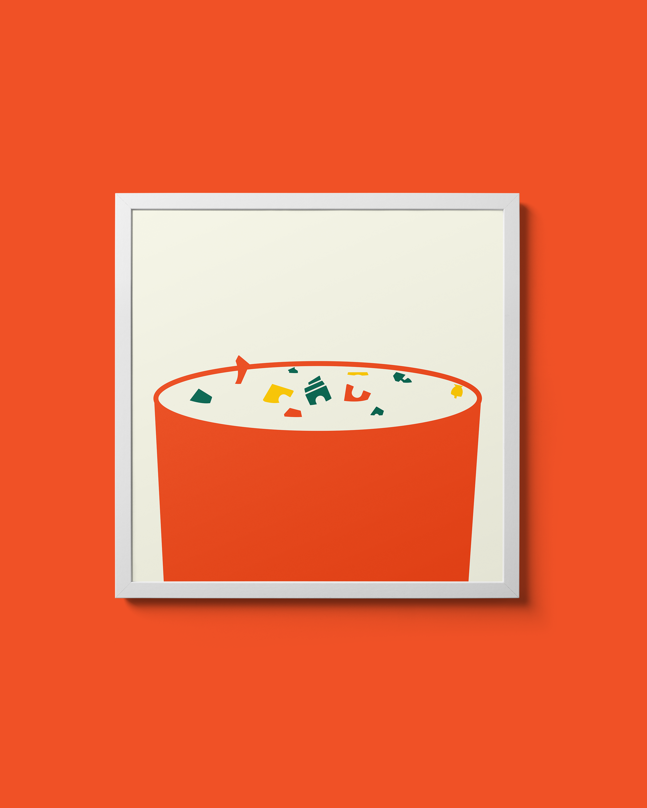
These furniture pieces exist all around the city, and if we could capture their forms in their essence, we could capture Anh’s home in the brand identity. A sense of “Clunkiness” is what we talked about during this project. It’s what makes these homes feel so lived in and distinct. That feeling is then transferred to the illustrations of furniture that exist around the cafe.
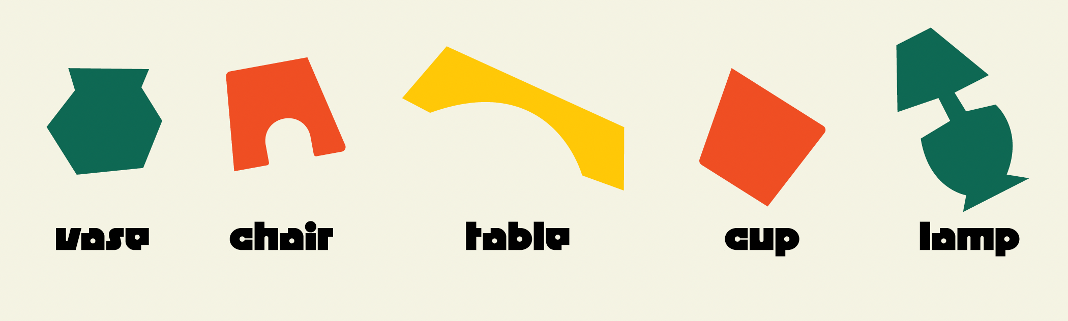
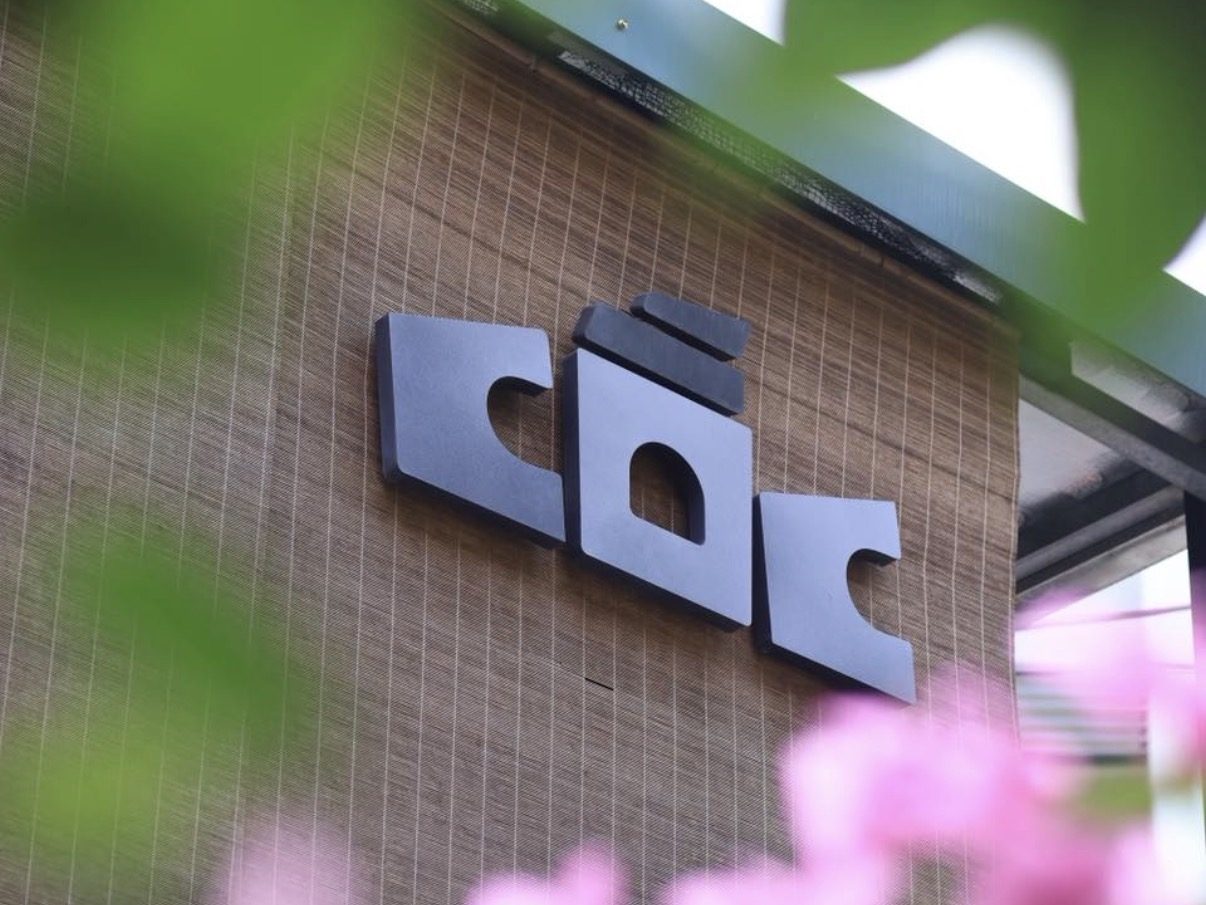
The logo of the cafe was then created after putting these future pieces together…
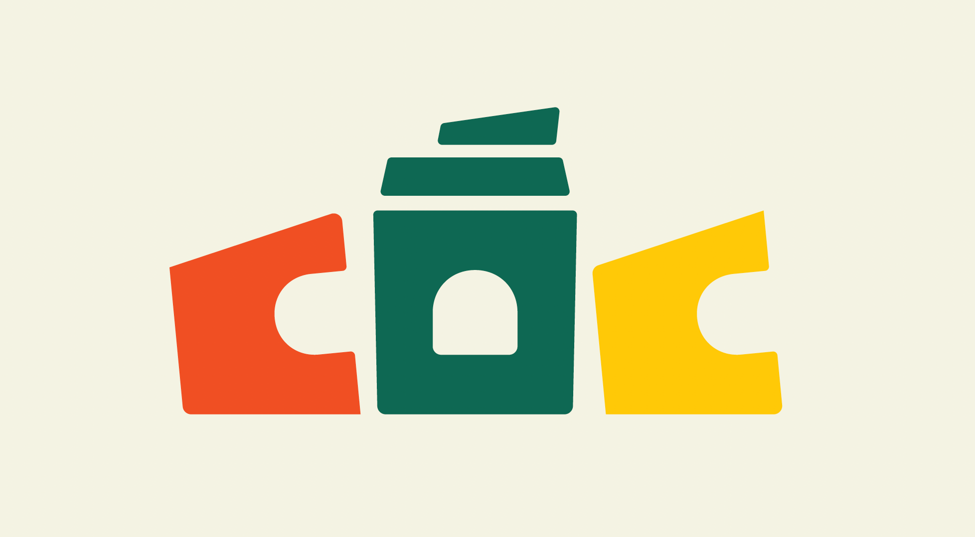
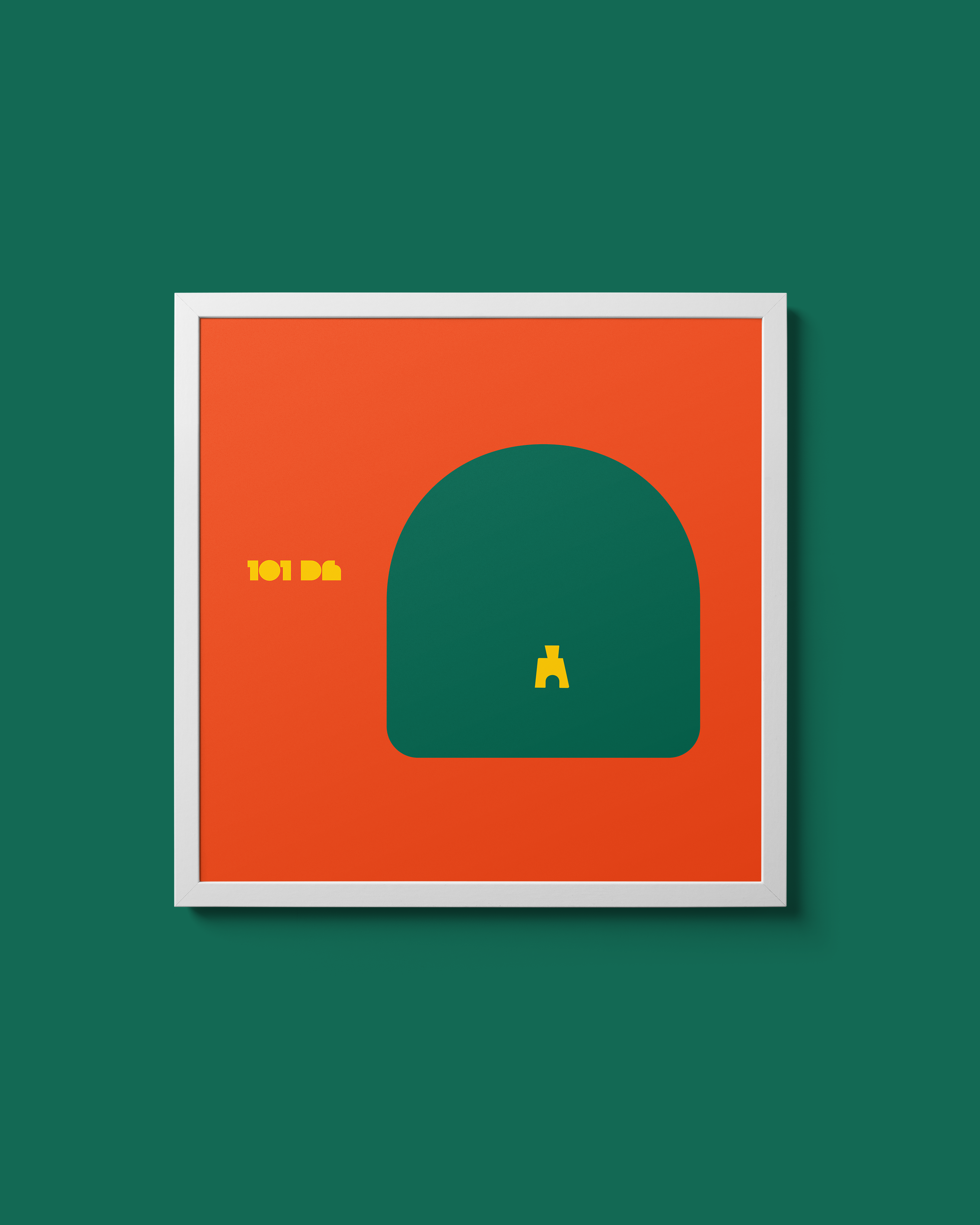
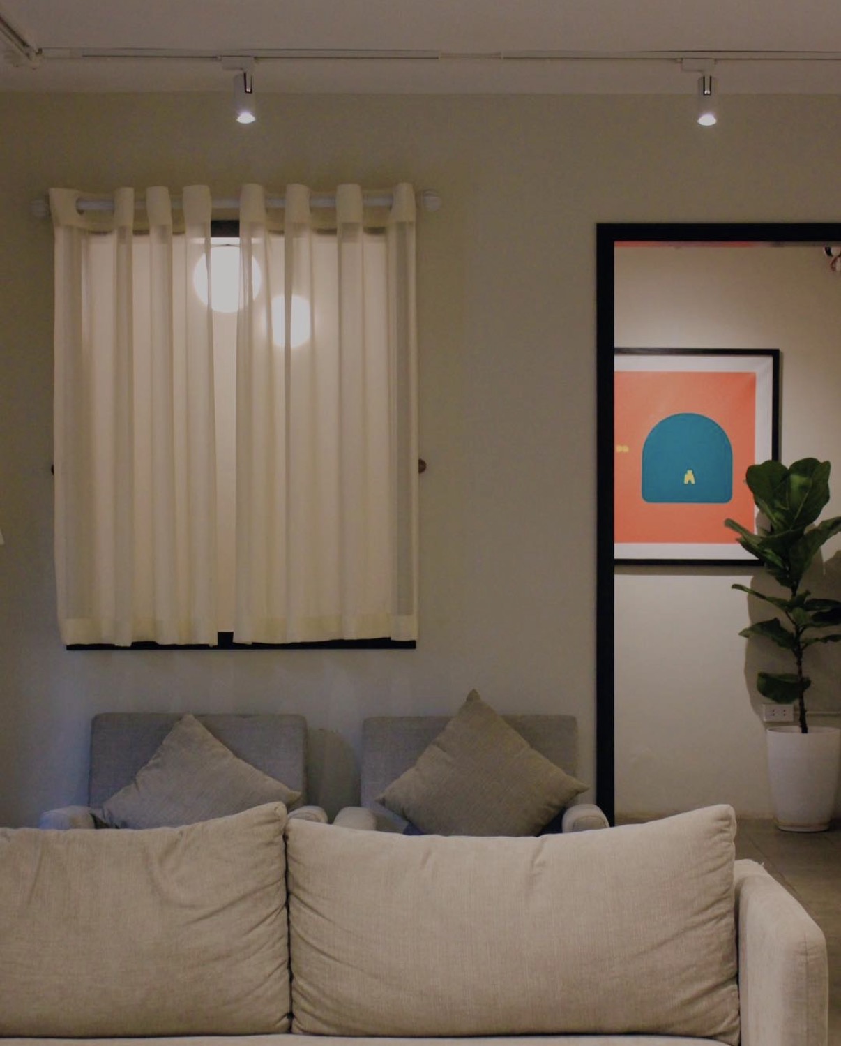
The arch is present throughout the branding of Coc. It is a central element that connects people to the home. As one looks through the arch, one is instinctively invited to walk in and become an honorary guest of Anh’s home. The rest, well, you probably could have guessed – coffee is served.
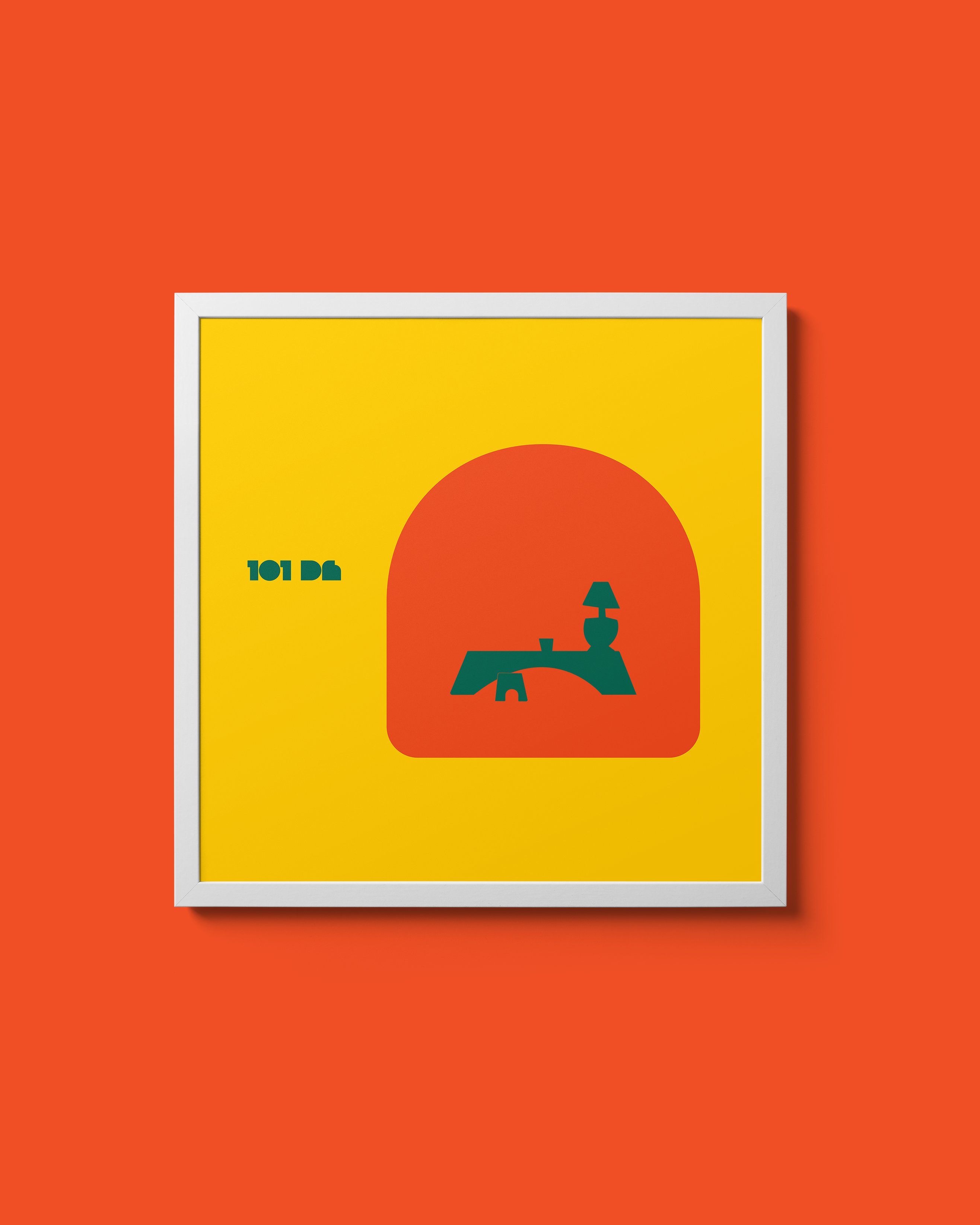
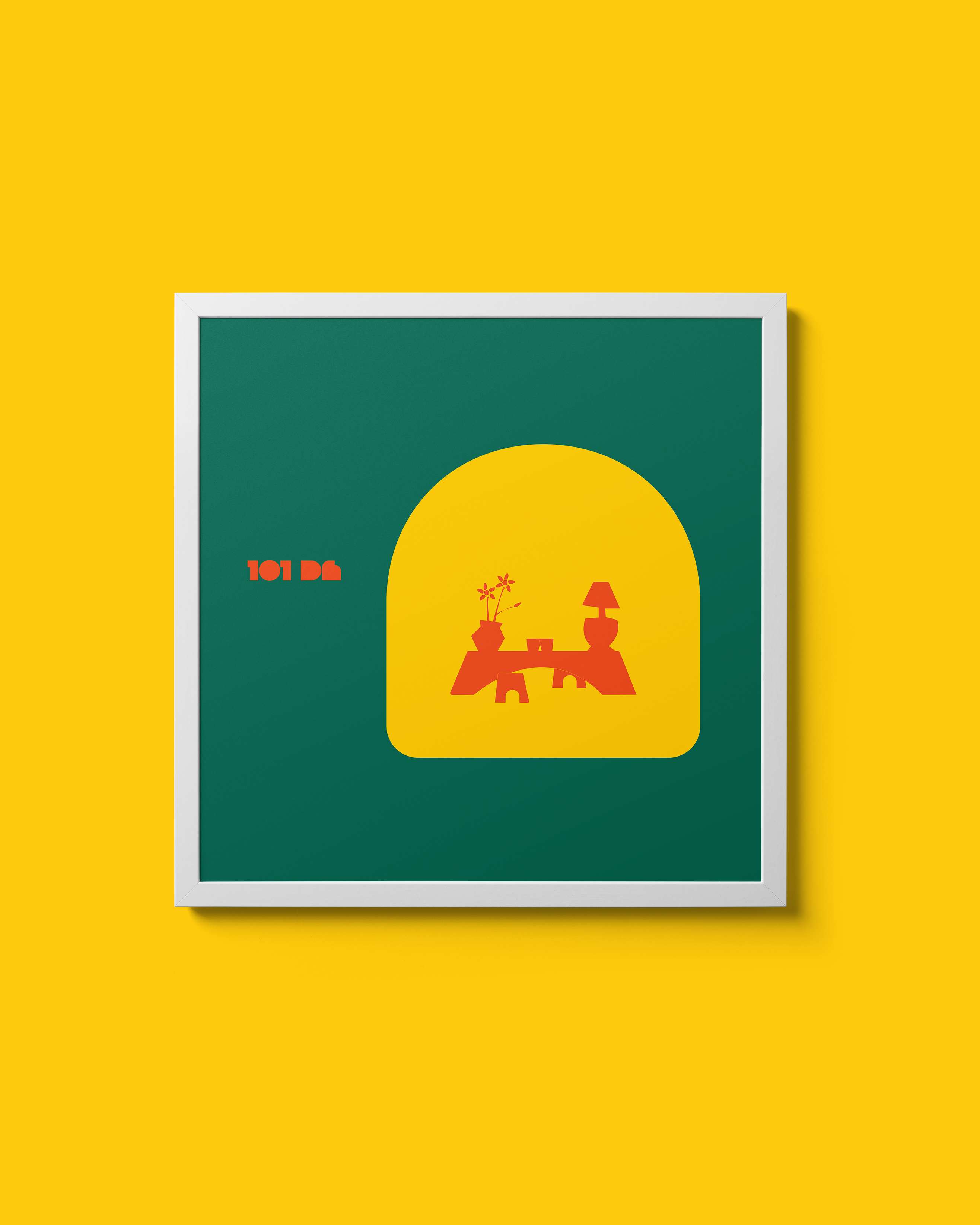
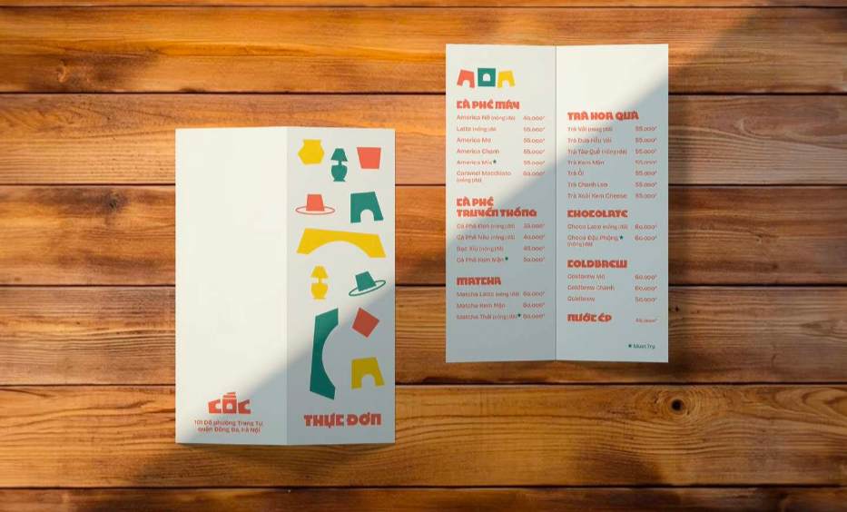
Posters made for spaces around the cafe
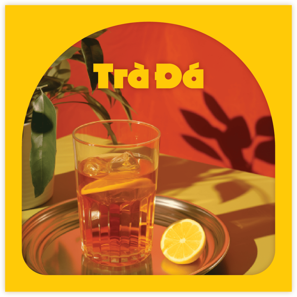
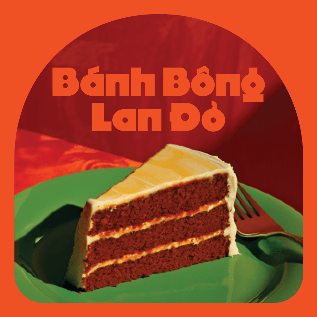
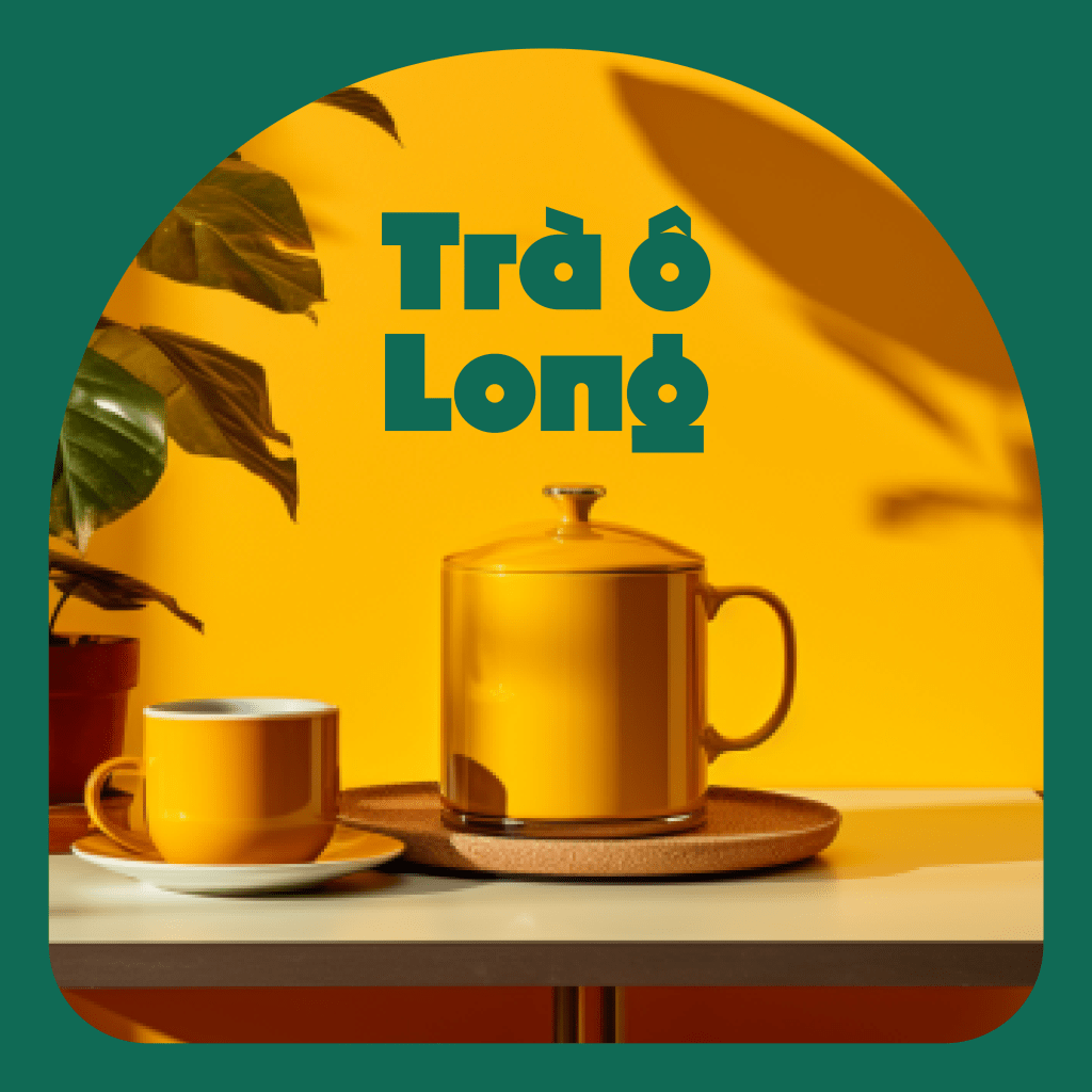
Social Media Templates
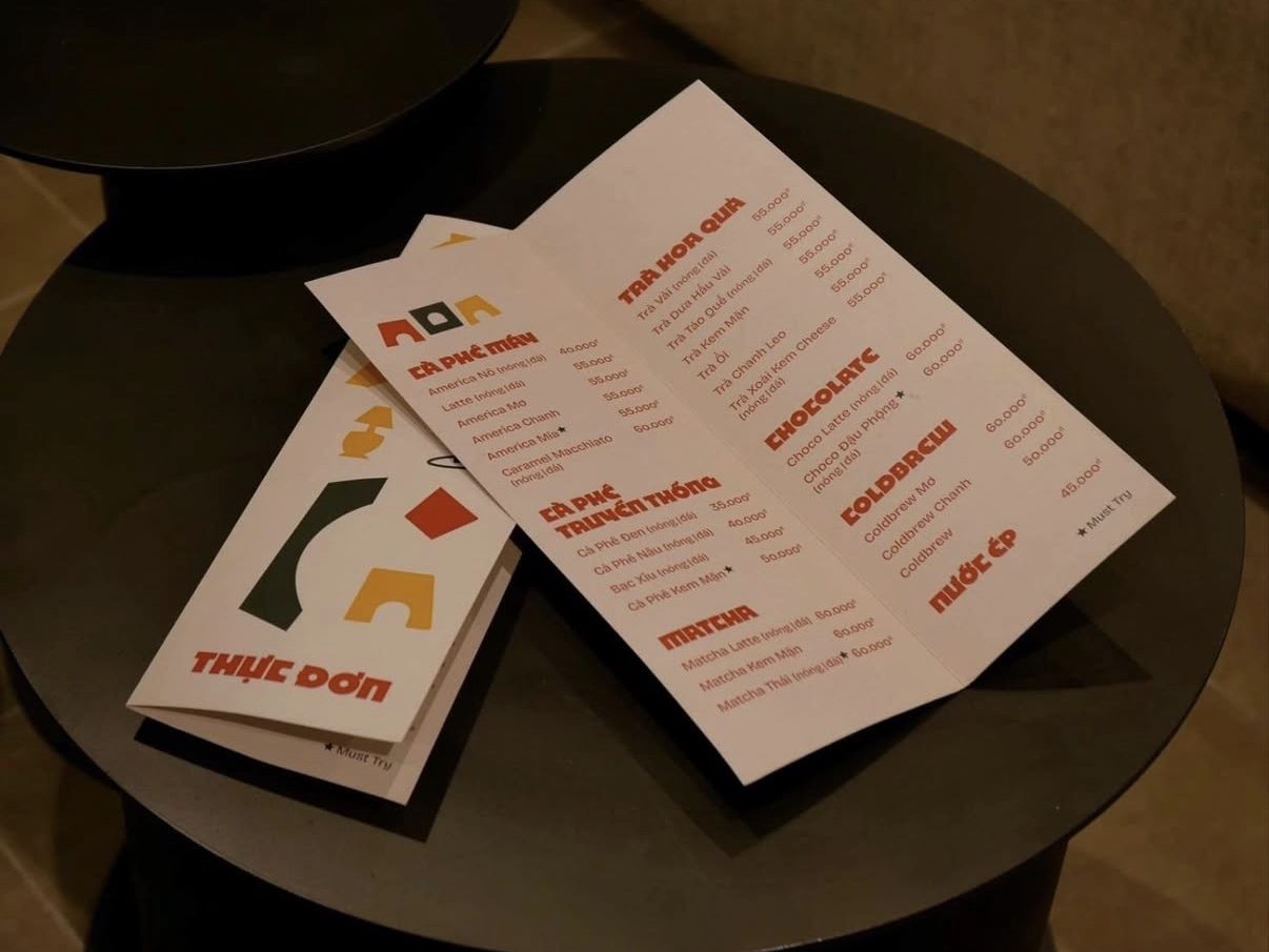
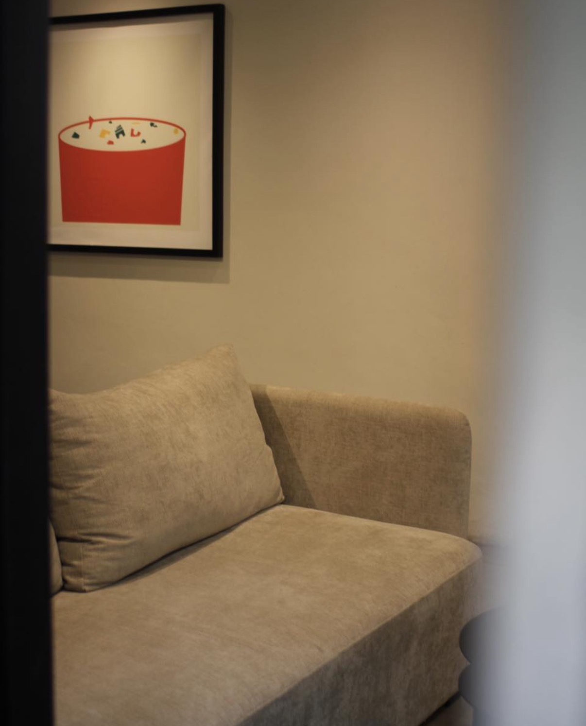
It’s almost impossible not to be enchanted by the cozy ambiance of Cốc cafe. And if you find it hard to tear yourself away, you’re in luck – at Coc, nearly everything you see and touch, reminiscent of Anh’s home, is available for purchase. That’s the twist!
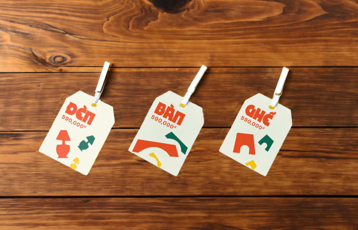
A little memorabilia…