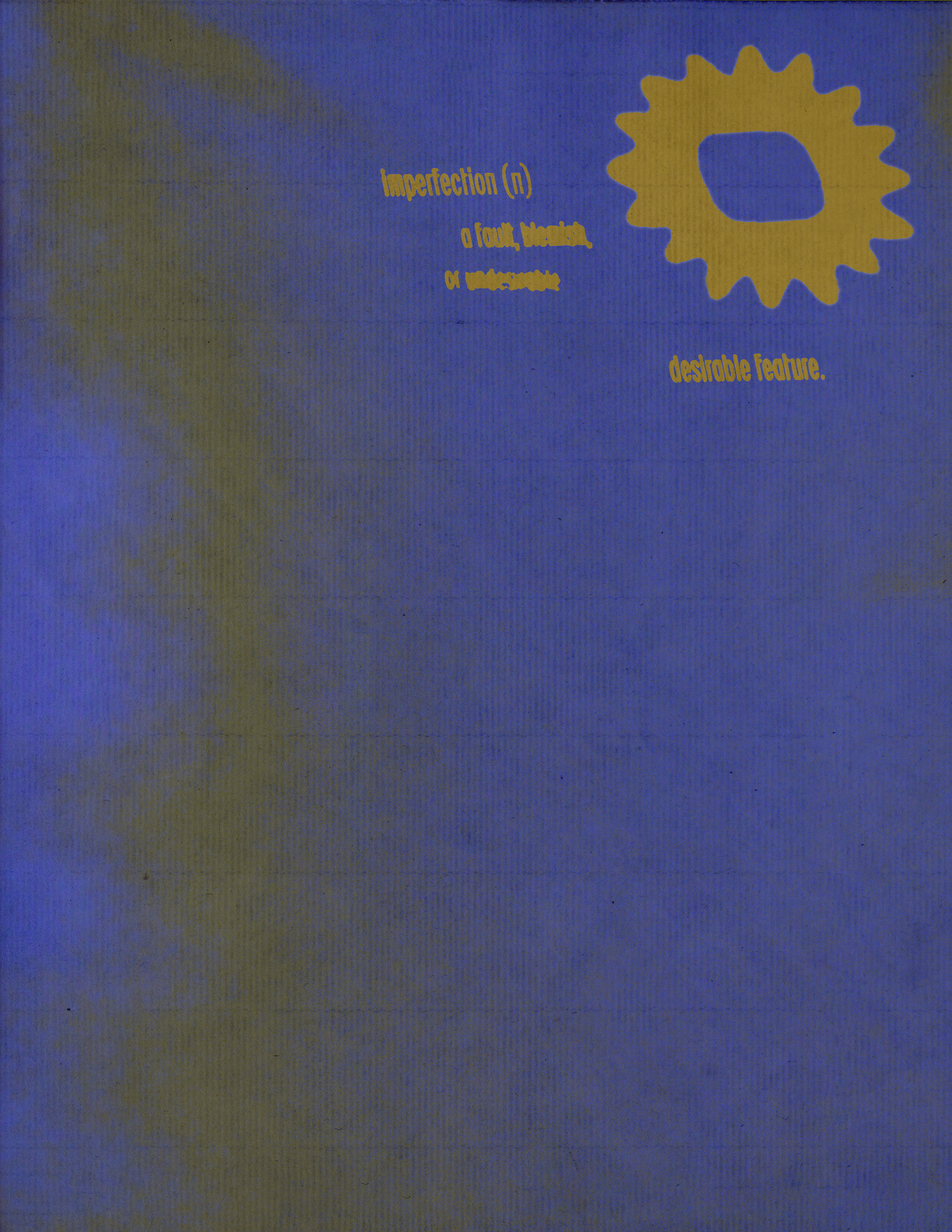
VGEERA is an art collective based in Charleston, South Carolina. They are a group of young artists, filmmakers, writers, and musicians. They embody imperfection. As young adults navigating an increasingly complex world, and as artists who feel a responsibility to express, Their logo isn’t to sell, but to express.
The Pursuit of Softness
VGEERA came to me at a time when my love for graphic design was waning. I looked around and felt as if the craft I fell in love with was being drowned in a sea of content. Everyone has their own *brand*. Logos is being made faster than ever. But it seemed like there wasn’t much love put into it anymore. Logos used to mean things. At least for me, I used to stare at the Apple logo for hours, wondering how such a distinct concept could be so simply made. Not only did I want to create graphics that can represent, but I also wanted to design a logo that can evoke emotions in people. Insert Elijah.
I’ve known Elijah for years for being a great film experimenter and a great friend. We talked so much about having a logo that was more than a logo. “An expression” is the exact word. The alignment was there for me instantaneously.
I started looking at a lot of art and logos during the 90’s. The energy artists gave off at that particular time, for me, was unmatched. And I wanted to embody that sentiment in this work.
The textures of the prints. The softness of the handmade work. The layering of colors. They were beautiful! Work nowadays has become so attention-seeking and stale that no longer can we feel any softness or vulnerability. Let’s bring it back!
Logos Can Be Sad, Too!
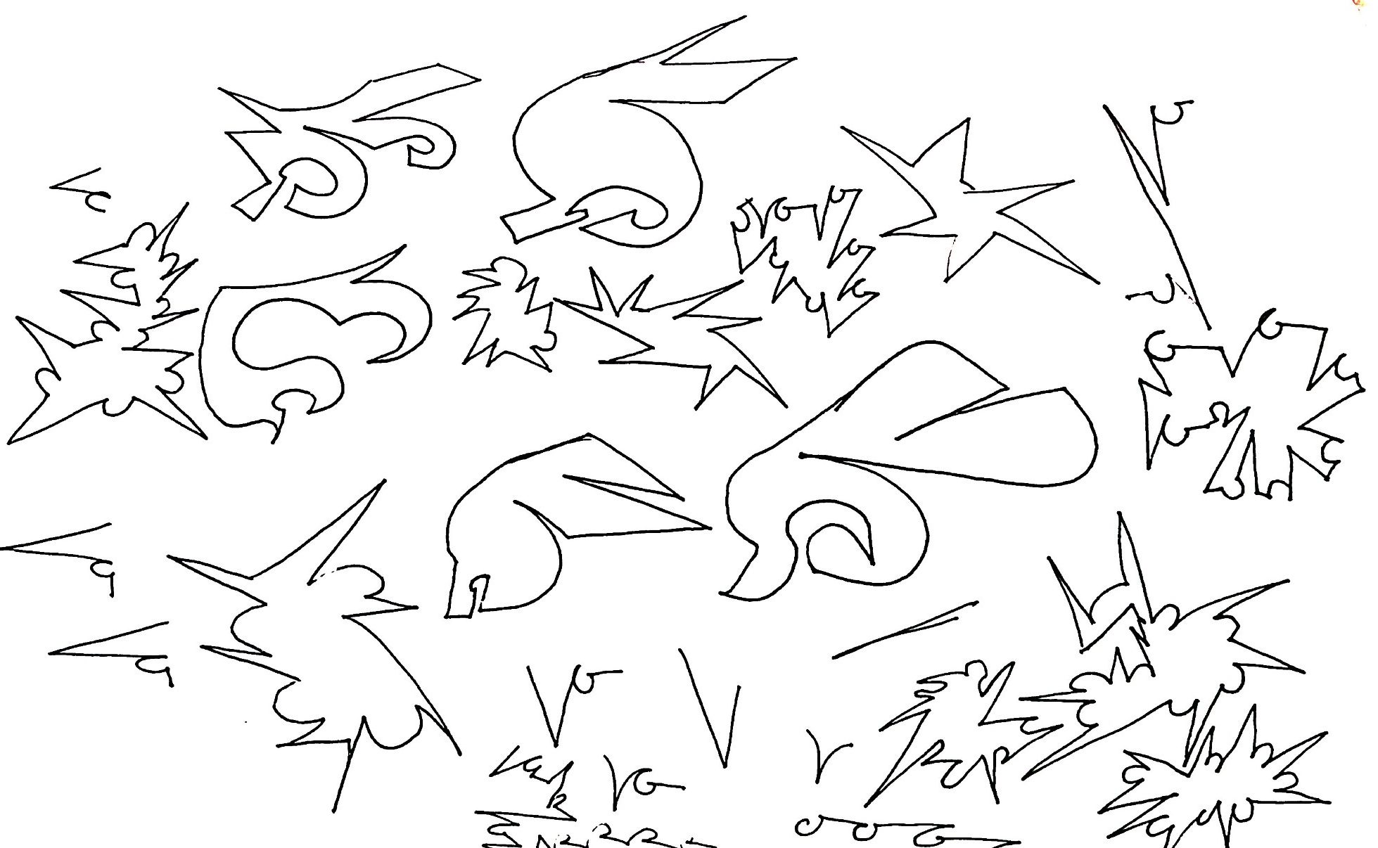
I started out just scribbling. Not letting any ideas dictate a shape. Right from the bat, I noticed that I kept on leaning towards making shapes that had a sharp edge following a curve.
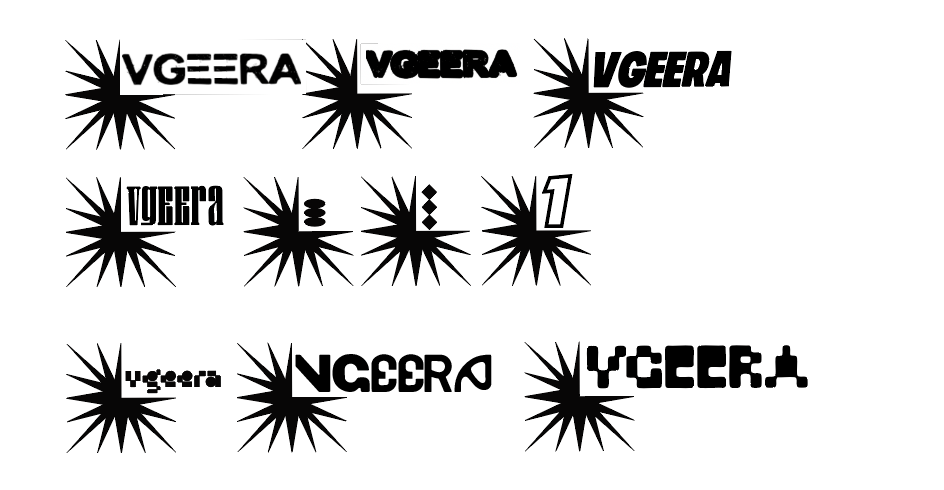
I also wanted to find typography that reflects a sense of liveliness, so I tested several with very different shapes and thickness.
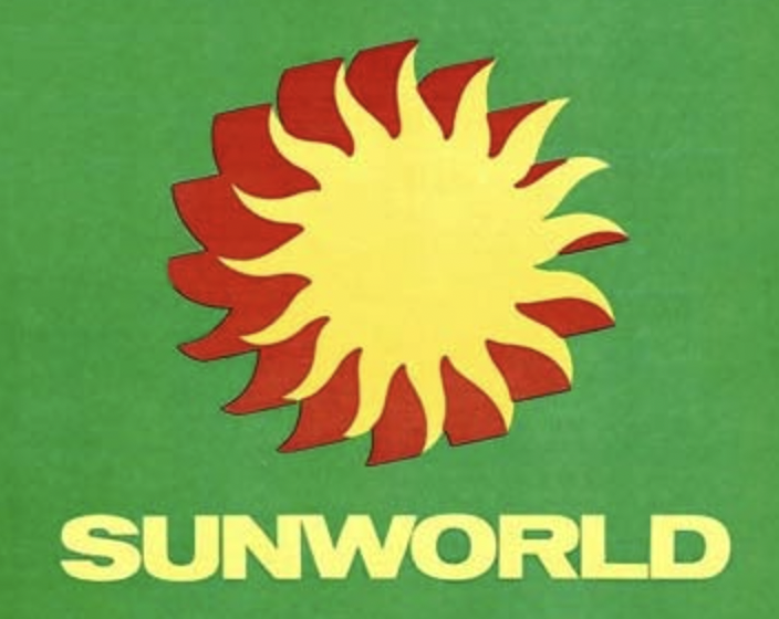
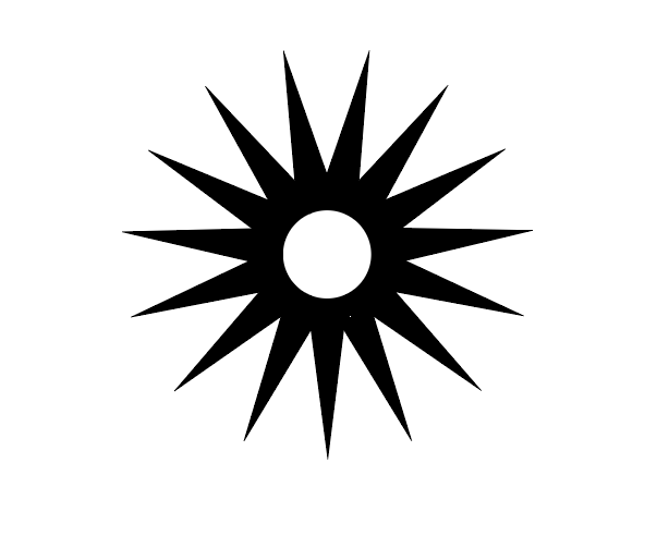
Even though I was quite happy with the likeness of the sun, I wasn’t a big fan of the sharp spikes. It still feels more like a logo than an expression.
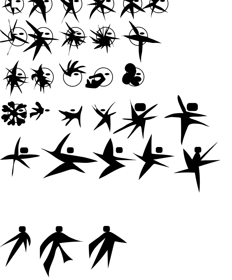
I, then, tried to make even less deliberate shapes, but as you can probably see, I felt like I was hitting a wall.
So, I went back to the shape of the sun.
VGEERA is a group of visual storytellers, and these stories are usually told through screens…
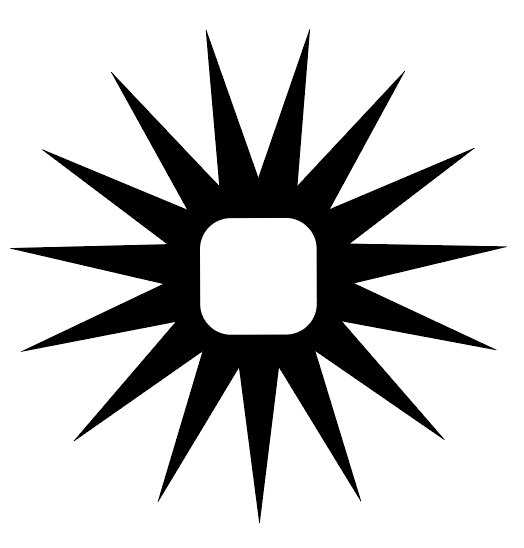
This logo needs to express an emotion, and I thought about how we never think if a sun ever feels … alone
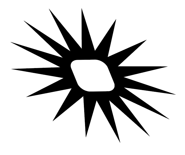
And that when we’re alone, our edges are dull, and we’re softer yet, in a way, more approachable.
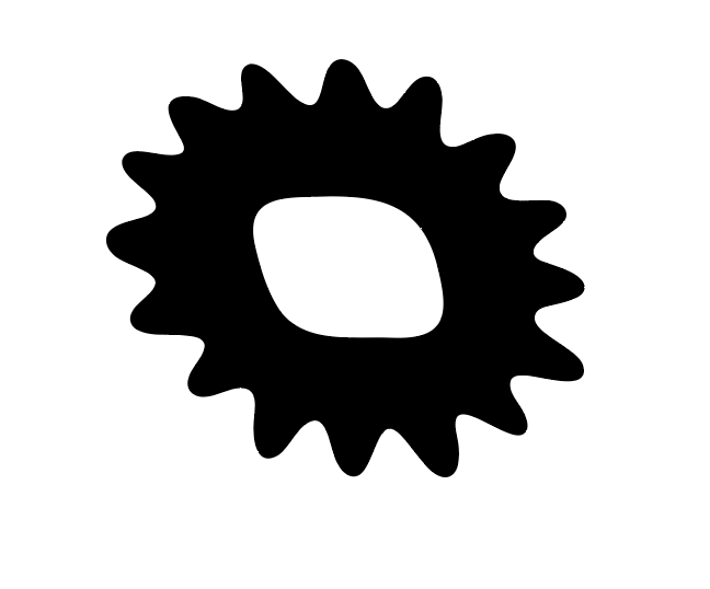
That’s VGEERA. Embodying imperfectionism. Within an expression, there isn’t a flaw, only what it is felt. That line of thinking also became the basis for more typographic explorations.

I chose a typeface called BC Ludva, which leans backwards like the symbol, and its parts aren’t necessarily smooth. Corners are sharper in order to create more contrast and express imperfections.
For the wordmark, I wanted to emphasize stretchability. Even when they’re concrete letters, I want them to have unity and to act as if they don’t want to leave each other’s sides.

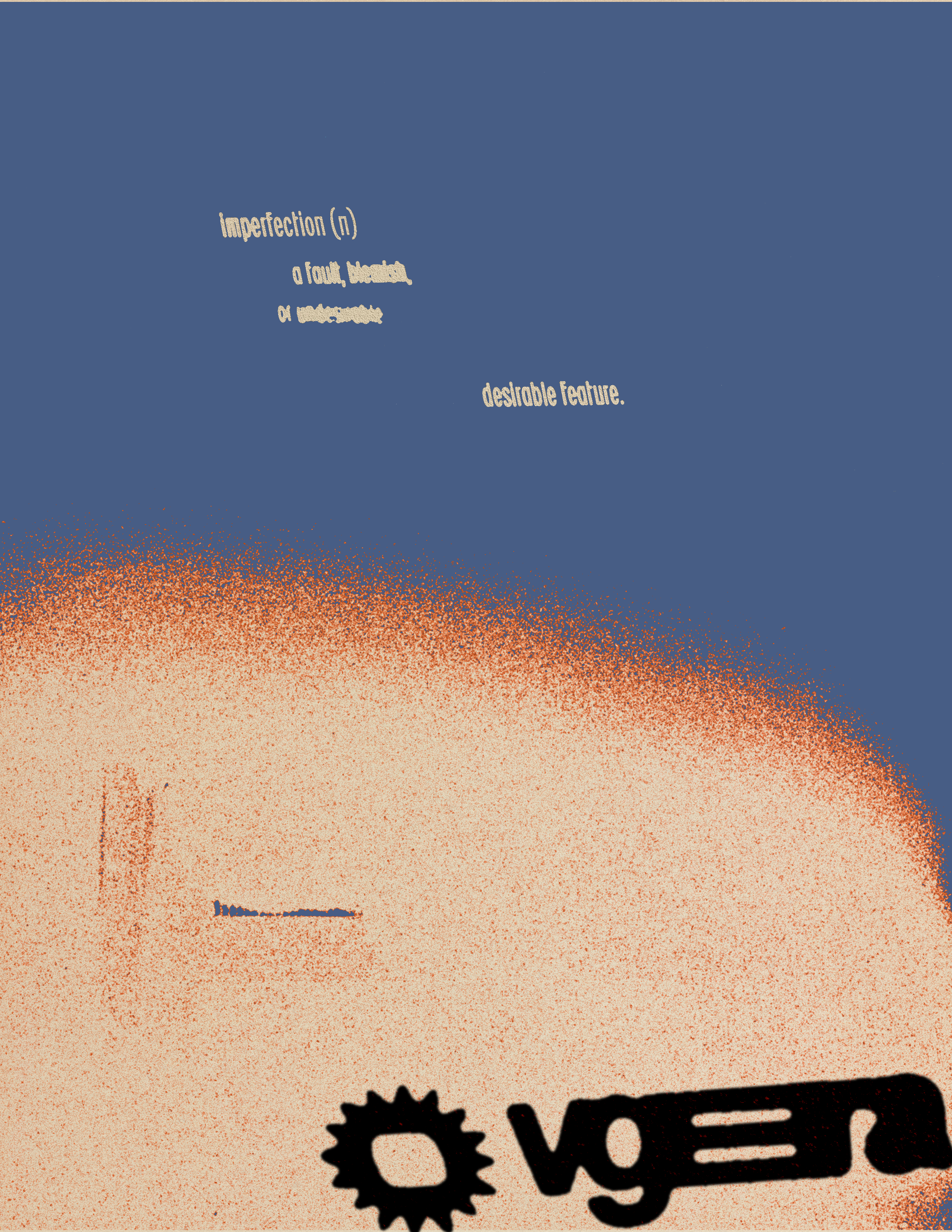
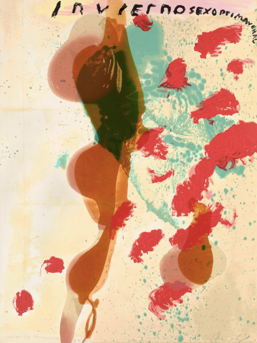
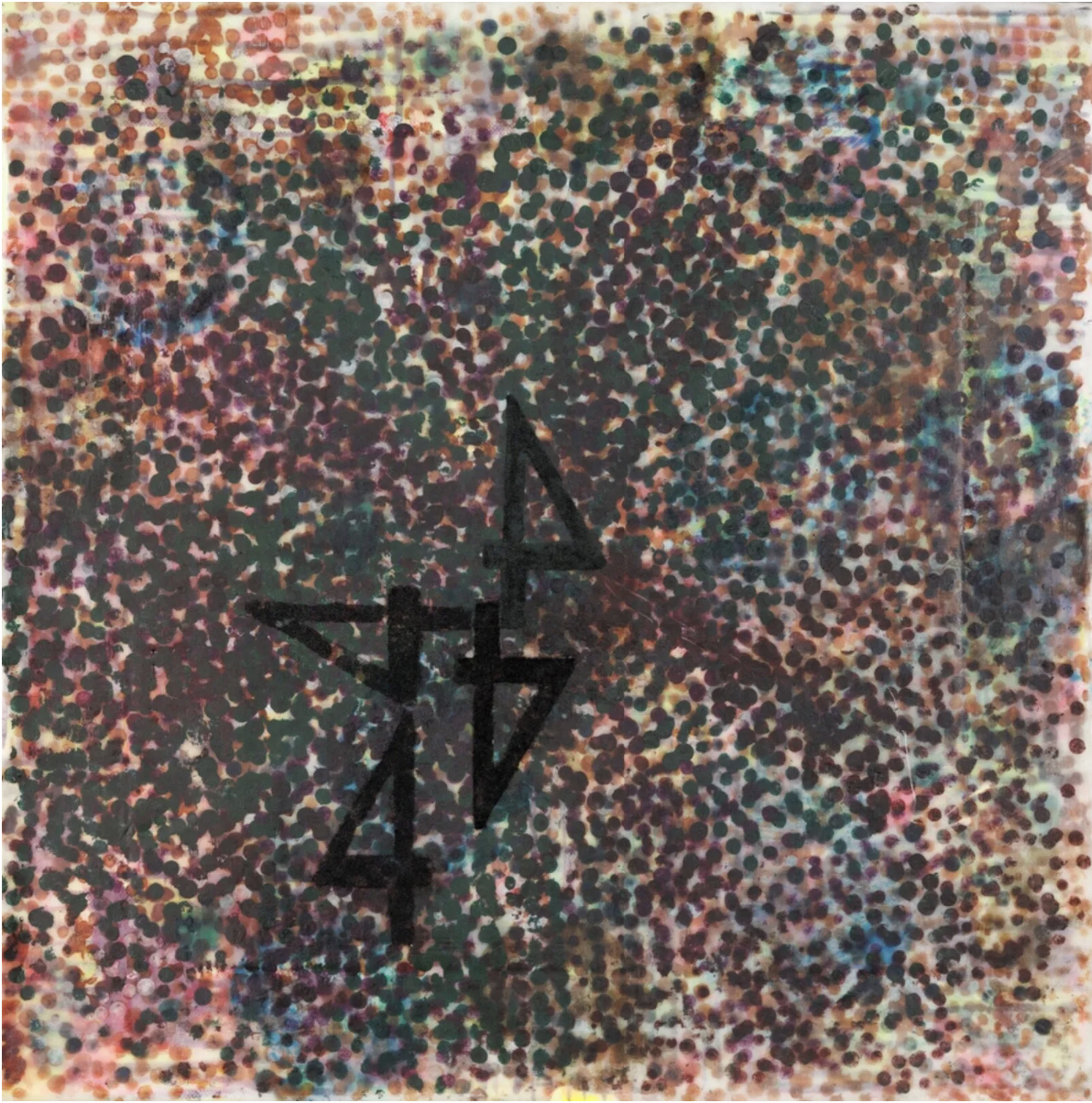
Posters Made With the VGEERA Logo
